Yesterday, we had a discussion at work about rems, ems and percentages. I’ve used ems for media queries for years. I’ve used rems for font sizing for a couple of years. I felt like I had a pretty good handle on how it all works.

Most of you probably understand the difference, but let’s do a quick recap to refresh. When sizing using rem units, the sizing is based on the HTML element’s font size. When sizing using em units, the sizing is based on the parent element’s font size.

Here’s an em unit example: I’ve created a module named .foo and it contains several other elements. I want the heading inside to be 32px, so I set it to font-size: 2em. If my body font size is equal to 16px, and as long as I’ve set no font-size on the the .foo module or any ancestor of it, it will be rendered at 32px. However, if the .foo module or an ancestor has the font set to “font-size: 14px;” or “font-size: .875em;”, that new size (from the ancestor element) will now cascade to the heading inside as the base to compute by, and our 2em heading will be rendered at 28px.

This is the reason many of us moved to rem units. It’s more reliable to set the font-size on the html element and, if left at the 16px default, you can be confident that setting a heading size to 2rem will always give you a heading rendered at 32px. If you’re the only person writing the code in the site, you can get that same effect with em units by having a rule set in stone that you never, ever, ever set a font size on anything other than type (p, hx, lists, etc). But that’s in a perfect world where you control all the code and never pass it off to another developer. If you do work with other people, things can become messy and unreliable.

This brings me to the reason for this post — using em units for your media queries. Much has been written about it over the years, but the short story is — for reasons related to content and line-lengths — I use em units for my media queries so that the breakpoints adapt to changing font sizes. If the user changes their default, or zooms the browser, all my breakpoints react to this new font-size base.

So what’s the big deal with the break points?

Based on yesterday’s conversation, I was doing an experiment. Since all my font-size, padding, margin, etc, is set in rem units, changing the size of the HTML element should scale the whole design either up or down. And it does. However, I expected it to also change the em-based breakpoints. It does not. I experimented with changing the size of the HTML element or the body element (sometimes even to straight up pixel values) and the breakpoints remained sized based on 16px. #headscratch (Here’s my Codepen to play with if you like: http://codepen.io/stefsullrew/pen/azRzOo)

After testing this several different ways, I did what one does — I reached out to the Twittersphere — the fount of all obscure knowledge. Within two minutes of posting, @susanjrobertson set me in the right direction: https://twitter.com/susanjrobertson/status/575378991017631744 I tested her theory, and by cracky, she was dead on! Fact is, the em base in media queries comes from the user’s setting (which is the 16px browser default if not changed by the user). The author has no control over this at all! Giving this some thought, it makes total sense. If my user has changed the default size of their browser to 32px because they have low vision, their line lengths will be shorter unless my media query breakpoints are now also using a 32px base and change accordingly. The same applies to zooming in the browser, I want my media query breakpoints to change based on their zooming. (Lyza Danger, who likely wrote the article I read years ago that got me started with using em-based media queries has updated this week to state that browsers have fixed zooming.)

The moral of the story is — your media queries, sized with em units, are going to be based on 16px per em unit — unless the browser’s font size has been changed by the user. You can not override the user’s wishes. This means that the idea of scaling a whole design by changing the HTML element’s default size (maybe up to 18px, or down to 14px) will not change your media queries base size. It absolutely will scale your whole design to use any base size you desire (when all your values are rem based) — but your media queries will still be based on 16px. So in my opinion, it seems best to keep the HTML element at 100% (16px) so that it matches the em units of your media queries (or the overrides of your user).

12 Mar: Edited for clarity & to update with Lyza’s update!

{ 11 comments }

Embed a survey in an email

by Stephanie Rewis on December 7, 2014

While implementing the trial automation flows at Contatta, one of my goals was to create an exit survey email for people who did the 30-day trial but had decided not to move to the paid plan. I wanted to send a simple, multiple choice question with the final option being “other,” so trial users could freeform an answer if it wasn’t offered. I don’t know about you, but I rarely want to click a “Take our poll” button in an email. But if it’s super easy, I’m willing to give feedback. So I wanted to make it as simple as possible to give feedback — so I could get the data I needed.

I know I can’t be the first person who’s wanted to do this. But I also know the overwhelming limitations of HTML email. I guess you could say, as I started my research, I was a hopeful skeptic. We had both a Survey Monkey and MailChimp subscription, so I started looking at the integration between them. But whether you create the integration from MailChimp to SurveyMonkey or from SurveyMonkey to MailChimp, you end up with the same thing. A button in an HTML email that basically says “Take the Survey” and then moves the user to the survey page. Nada.

After digging around on the internet a bit, I was beginning to become less hopeful. I’m a huge proponent of “needs to work everywhere.” So a Google form integration was out of the question.

Somewhere in my research, I found an idea that showed promise. (Sadly, I haven’t been able to come up with the article in subsequent searches to give the author credit.) The article talked about “faking the poll” by putting images of radio buttons along with the questions in your email. The link placed on the image of the question is a custom URL with a different variable appended to auto-submit the answer to the form (access to this required me to upgrade our account level). This works great for a yes/no question or even for a “rate this” question. But mine was a little more complex. I needed anyone selecting the answer “other” to be able to submit further information.

I started testing the theory. Maybe I could put a further question on the thank you page. The answer to that turned out to be, nope. But I found, if I upgraded my subscription, I could use a custom redirect on my thank you page. I decided to create a second form that appeared to be a thank you page, with an area that could be used to leave further info. Though in the end, I would have two forms, it would still meet our needs giving the user the easiest method to interact with us.

I rolled up my sleeves and got to work. I upgraded our account to Gold level ($300 per year). I immediately got the redirect working. That’s when I discovered that though it appeared upgrading to Gold would get me both the redirect and custom variables, in reality it only got me the redirect. I was going to have to upgrade to Platinum level ($780 per year) for that. Being a startup with a purposely lean budget, that wasn’t happening. (I found through a later Support conversation that there was a bug on their website that didn’t make clear what level you needed to upgrade to if you are a paying customer. I’m sure they’ll fix that soon.)

Round Two

Time to see if I can get the custom variables and the thank you page redirect I needed — at a more reasonable cost. The other survey integration I’d seen while perusing MailChimp integrations was SurveyGizmo. I was unfamiliar with SurveyGizmo, but I figured they’d probably be similar to SurveyMonkey — perhaps with even less features. I signed up for the 7-day trial and started poking around.

I very quickly got a redirect of the thank you page working (their knowledge base section is quite good). I had to get a little help from their Support folks (also really awesome) to get my custom variable working, but I was shocked at how quickly I was able to implement the process I had designed.

Then I had a horrible thought. Now that everything was working and I was ready to pay, what if during trial they enable ALL THE POSSIBLE THINGS and it’s actually more expensive than Survey Monkey? I called them. (I hate using the phone, so this was clearly a desperate situation.) They confirmed that everything I had accomplished was at the lowest Solo level ($162 per year). I have to admit, I was flabbergasted—as well as super excited. Credit card engaged — Subscription unlocked!

If you’d like to embed a survey in an HTML email, read on. I’ll list step by step what I did to make this work.

Add an actionable survey question into an HTML email with SurveGizmo and MailChimp

1) At SurveyGizmo, create a form with your one question (multiple choice). Tip: Be aware that if you choose radio buttons, they will only be allowed one answer. If you choose checkboxes, they can choose multiple answers. (Though they have to return to their email to choose a second option, my experience has shown that some users will do that.) The form doesn’t need any styling since it will never be seen by the user.

Note: If you already have a SurveyMonkey Platinum account, you can create the same functionality — I’m just not listing the steps here.

2) Create a second form with a question that allows an “essay/long answer” so they can leave you further feedback. I also added a way for someone to request to be contacted and leave their name and contact information. Style this form as if it’s a thank you page for the first form. Click on the “Share” tab at the top and copy the link for this form. You’ll need it shortly. (You may want to customize the name of the first form since people may see it in their browser when they click your links.)
Find your survey link

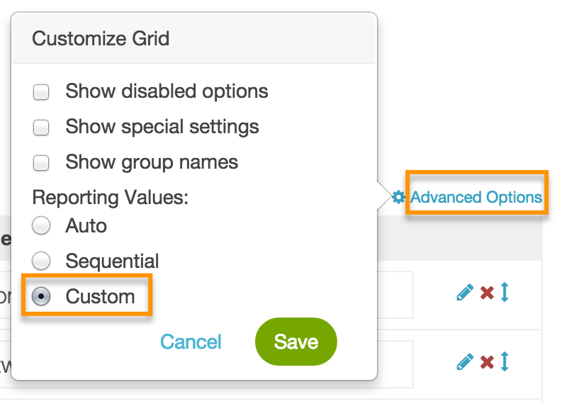
3) Let’s create the URL variables for the first multiple choice form—the one that’s included in the email. Click edit and open your question. To the right of the “Answer Options,” click Advanced options and choose Custom.

The reporting values are what you will use to customize the URL in your email. I played around with this a bit. What I landed on was simply giving them the values of one, two, three, etc. — due to the fact that my team was changing what those questions were and the reports area of SurveyGizmo will show you the actual answers. (This is their help page.)reporting value

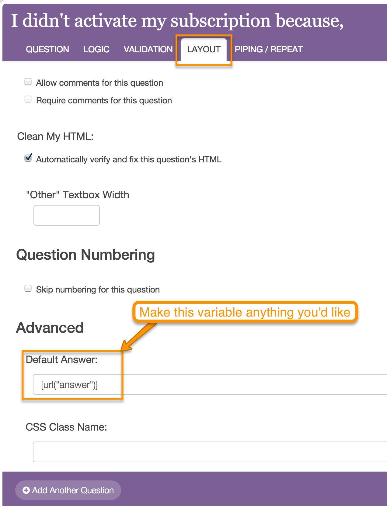
4) The second half of creating the URL variable is the merge value. While editing the question, click on the layout option. Scroll down to the Advanced area and add whatever you’d like to use for the URL variable. (I used the term answer.) This is the format: [url("yourtermhere")] variable value

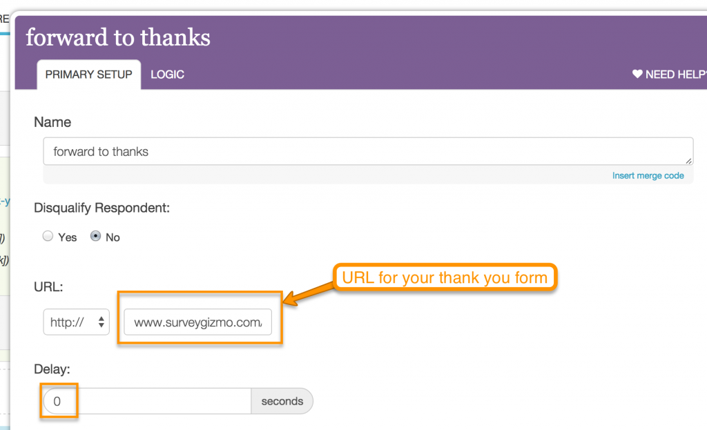
5) Move down to the bottom half of the page of your first form. This is where you’ll redirect the thank you page to the URL you saved for your second form. Create a new Action. Redirect it to the second form you’ve created with a 0 second redirect: redirect the thank you page
(SurveyGizmo’s instructions are here.)

6) Now we’re ready to add the link to our HTML email in MailChimp. First, you’ll need to create an image that appears to be a radio button. I did it in a super highly advanced way — I went to a real form on my website and did a little screenshot. ;)

I’m a huge accessibility advocate. Also, I know that some people open email with images turned off by default. For that reason, I chose not to include the words of the question into the image of the radio button. I want them to be real words. The radio button and the words/option next to it should both be linked to the same place. I put inline CSS onto the linked words to remove the underline from the link on the question — that way, it appears that the radio button and option next to it are associated, just like a regular form. Put a the radio button and linked words into a table in your email so that no matter what device your user is on, they’ll remain together.

7) Go to your first multiple choice form and copy the URL you’ve chosen to use. Then, add the merge value along with the reporting value. So for example, since I chose to use “answer” as my merge value and one, two, three, etc for my reporting values, my URL would look something like this:

http://www.surveygizmo.com/data/nameofform?answer=one http://www.surveygizmo.com/data/nameofform?answer=three

You get the picture. Essentially, you’re letting the image of the radio button and the words of the linked option automatically submit their answer to your first form — then quickly roll to your second form — the “fake” thank you page. If they choose to give you further information, you’ll get that in the second form report.

There are a couple other little tricks I’ll share in a follow up post. You can pass more data to SurveyGizmo from MailChimp (like first name, email, etc) and even customize your thank you page/form with that data. But this has gotten long…

Cheers! And please share your tricks in the comments.

{ 0 comments }

Life is a journey, not a destination

by Stephanie Rewis on November 16, 2014

I’ve been quiet lately. Startup life is busy… and exhausting. Blogging for me has pretty much gone the way of the Dodo. I’m planning to change that.

Since technology is increasingly involved in a modern company’s marketing department, it’s become quite common for those of us who are developers to find ourselves deeply involved with our marketing team. Almost two years ago, I took on the role of “Director, Web Strategy and Marketing Technologies” at Contatta. As a small startup, it means I personally handle a whole host of technology decisions and implementations — and I do it within a limited budget. Sometimes that requires me to get creative instead of going for a big all-in-one solution.

Though early in my career (building small business web sites) I regularly provided clients with organic SEO and analytics, the techniques I knew have changed. We now use schema and OG markup. Google Analytics has been upgraded to Universal analytics. There are additional analytics tools available like Mixpanel and Kissmetrics. There are also a whole host of things that I didn’t regularly offer back then — like A/B testing, heat mapping, multiple landing pages, and very few clients used email marketing. Through a lot of trial, and some error too, I’ve been creating a system that gives us the ability to test, analyze and iterate quickly.

I still do all the front-end development for Contatta’s website and blog — and I’ll continue to blog about web techniques and technology. But I’ll also start sharing posts with marketing technology-related information. Tips and techniques, and creative ways I’ve found to make things work on a budget. (I’m probably posting these as much for me as for you. More than once, I’ve done a search for how to do something and found the answer in one of my own, older blog posts. It’s one of the best reasons to blog—I can’t remember everything—even when I once figured it out.)

I’m enjoying this journey. I hope you’ll share things you’ve learned with me as well. Cheers.

{ 0 comments }

Font Smoothing — It’s not just for Webkit anymore

April 24, 2014

I ran into a very frustrating bug while using icon fonts on our site at Contatta. A bug I filed last April, and nurtured through the process of getting fixed, didn’t make the Mozilla release notes (though it was included in Firefox 28). Because I feel it’s a very useful solution, I wanted to bring [...]

Read the full article →

New Directions

March 2, 2012

In 1999, when I started my journey through the interwebs, I had no real idea where it would take me. I barely knew what was possible. I only knew that my brain loved puzzle-type thinking, detective work, research and figuring things out. And I suspected code would access the parts of my mind that love [...]

Read the full article →

CSS3: spread value and box-shadow on one side only

September 8, 2011

This morning I awakened with a question in my twitter stream from @deebeefunky. He was frustrated by the fact that when he sets a blur on box-shadow, it shows on two sides of the box. He wants it to show on only one side. Of course, that got me thinking. I did come up with [...]

Read the full article →

Firefox multi-column layout bug… and a unicorn

May 4, 2011

Last night, I was getting a file ready to share with Estelle Weyl, one of my co-presenters for our CSS3 workshop at SXSW11. The page was a silly little demo that used media queries, multiple backgrounds, transitions, generated content, multi-column layout and, well, a unicorn. I had only viewed the file in Chrome since that’s [...]

Read the full article →

Changing a Background-image with CSS3 Transitions

March 1, 2011

As you may have read, outside of gradients, you can’t change a background-image with CSS transitions. Or can you? At InControl Conference last week, Greg Rewis spoke about Transitions, Transforms and Animations. A question was asked about showing one background-image on load and transitioning to another in a subsequent pseudo-state. You can always change the [...]

Read the full article →

CSS3 Flexible Box Model…Layout Coolness…also Oddities & Confusion

February 25, 2011

In August, due to a twitter discussion with Molly, and of course while partying on a Saturday night, Dave Gregory and I were looking at whether the Flexible box layout module (still a working draft) is getting close to ready for prime time yet. Our hope was that it will solve some of the frustrations [...]

Read the full article →

HTML5 and Video: 4 part video series

January 10, 2011

I’ve had a couple people ask me to link on my blog to my four part video series on HTML5 and video. Currently, it’s a feature on the AdobeTV home page, but I reckon that will be for just a little while. After that, you can link directly to Part 1 (7:18), Part 2 (10:31), [...]

Read the full article →