This morning I awakened with a question in my twitter stream from @deebeefunky. He was frustrated by the fact that when he sets a blur on box-shadow, it shows on two sides of the box. He wants it to show on only one side. Of course, that got me thinking. I did come up with one solution—it won’t work in every situation—but it may work in yours.
The spread value
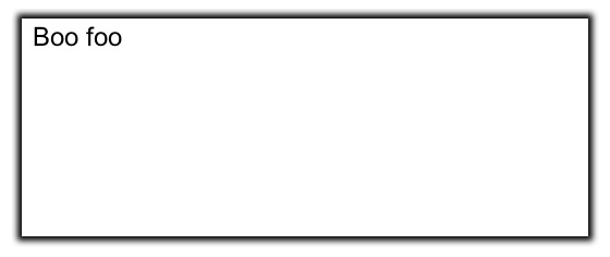
There’s a little talked about value in the box-shadow property called “spread”. That value, when used, comes after the blur value and moves the shadow away from the box equally all the way around. It doesn’t add a blur, it simply spreads out in all directions. You’ll get different effects based on whether the blur value is a greater than the spread value or whether the spread is greater than the blur. The color defined will be solid right next to the box, and then blur for the rest (based on the difference between the two values). Before it gets too confusing, let’s have a look at the property:
box-shadow: (inset) x-value y-value blur spread color;
div {
-webkit-box-shadow: 0 0 6px 4px black;
   -moz-box-shadow: 0 0 6px 4px black;
        box-shadow: 0 0 6px 4px black;
}
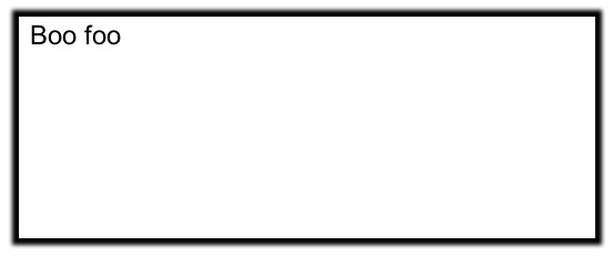
If the spread value has a higher value, you get a different effect with the full spread and only a little blur.
div {
-webkit-box-shadow: 0 0 4px 6px black;
   -moz-box-shadow: 0 0 4px 6px black;
        box-shadow: 0 0 4px 6px black;
}
Though the differences above are subtle, you can actually create some really interesting effects with this value. If you don’t move the box-shadow on the x or y axis and provide no blur value at all, you can create one, or more, multiple borders for your element.
Create the look of multiple borders
div {
border: 3px solid orange;
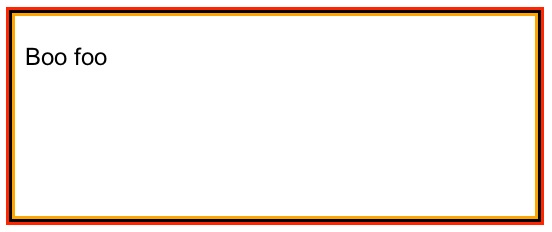
-webkit-box-shadow: 0 0 0 3px black, 0 0 0 6px red;
   -moz-box-shadow: 0 0 0 3px black, 0 0 0 6px red;
         box-shadow: 0 0 0 3px black, 0 0 0 6px red;
}
Notice it appears there are three borders on this element. A single (orange) border was added, then a black border (created with the 3px of spread) and then a red border (the 3 px border is created by 6px of spread since you must allow for the first box-shadow). It’s unlikely you’d actually need more borders than this, but you can create an unlimited number this way. Remember that when using multiple box-shadows, the first one is applied closest to the element.
How does this apply to @deebeefunky’s question?
I’m glad you asked! Sometimes I get off track (you know, that simple little blog post you were gonna write…). The issue with box-shadow is, even if you only move the shadow on the x or y axis, you’ll see a hint of the shadow on at least two sides of your element.
div {
-webkit-box-shadow: 1px 0 2px black;
   -moz-box-shadow: 1px 0 2px black;
        box-shadow: 1px 0 2px black;
}
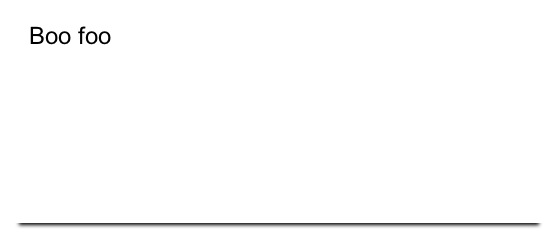
I came up with an idea that works as long as A) the element is a solid color and B) you’re not also using border on the element. It involves applying two box-shadows, one with spread in the same color as the box itself and another without. Like so:
div {
background: white;
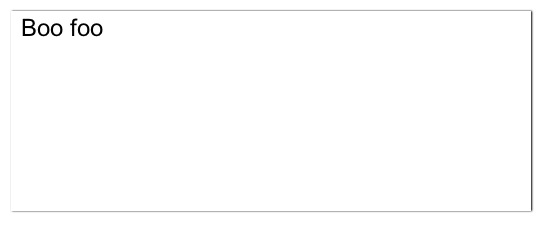
-webkit-box-shadow: 0 0 0 4px white, 0 6px 4px black;
   -moz-box-shadow: 0 0 0 4px white, 0 6px 4px black;
        box-shadow: 0 0 0 4px white, 0 6px 4px black;
}
Why does this work?
In a nutshell, what you’re doing is creating the first box-shadow (0 0 0 4px white) which doesn’t move on the X or Y axis, doesn’t provide any blur, and has the 4px of spread set in the same color as the background of the element. This basically renders it invisible but makes the element 4px wider than it was (box-shadow does NOT add to the box model, so you’re element will appear 4px closer to the elements around it as well). Remember the order I mentioned before? The first box-shadow is placed on top—or closest to the element? That’s what helps us here. The second box-shadow (0 6px 4px black) is moving 6px on the Y-axis, has 4px of blur, no spread and is black. We’ve moved this vertically—though you could use the same technique on the X-axis.
Where is the real border?
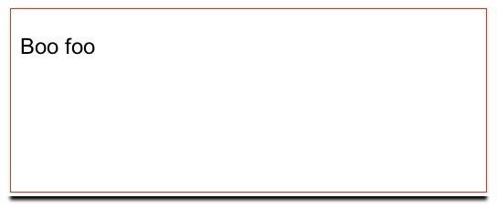
Just to illustrate why you can’t use a border with this technique, here’s a look at the addition of a red border to our previous example.
The thing to remember when using this technique is A) you can only move on one axis— X or Y and B) your blur value cannot exceed the spread value given in the first box-shadow. If it does, you’ll start to see it peek out on the sides (an effect we were avoiding in the first place). You can, however, move as much or as little on either the X or Y axis as your effect requires. And as always, using RGBA or HSLA color values will give you a more realistic shadow if that’s what you’re after.
Update: Method Two
If you have a patterned background on the element or need to use a border, Joseph Silber had another idea in the comments below. Use a negative spread radius. Nice thinking, Joseph! Playing with this method, I came up with the following:
div {
	-webkit-box-shadow: 0 8px 6px -6px black;
	   -moz-box-shadow: 0 8px 6px -6px black;
	        box-shadow: 0 8px 6px -6px black;
}
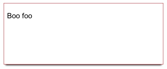
The issue to be aware of with this method is, the negative spread value should be equal to, or greater than, the blur value or you’ll end up with a slight blur on the other two sides of the element. Also, very little of the box-shadow will show if you don’t give the X or Y a value equal to, or greater than, the blur. Otherwise, the blur is slightly hidden behind the edge of the element since the spread value is negative.
Notice the element isn’t “expanding” like it did using the first method (the box size is what you’d expect), but the shadow doesn’t quite go to each edge due to the negative spread value. Based on the interaction with other elements on your page, one of these two methods might just work for you!
Update Oct 2
Due to an Android bug when the box-shadow has no blur, you’ll likely want to use the second method if you want the shadow to appear on an Android device. Let’s hope they fix this one soon. (Thanks, Luís Carmona!)
Do you have a method you use to create the same effect? Share it in the comments. Happy coding!


{ 24 comments… read them below or add one }
clever clever.
Using an element to wrap the element getting the box-shadow and a overflow: hidden on the wrapper you could make the extra box-shadow disappear and still have a usable border.
This also fixes the problem where the element is smaller as it seems, because of the spread.
Like this:
#wrapper { padding-bottom: 10px; overflow: hidden; }
#elem { box-shadow: 0 0 10px black; }
Content goes here
Still a clever solution when it has to be done in pure CSS!
Why not simply a negative spread?
div {
height: 100px;
width: 100px;
box-shadow: 5px 0 7px -5px black;
background: #E4FCE4;
}
http://jsfiddle.net/MceL6/
Thanks Chris… it’s one way to do it.
Jorgen – I try to avoid extra elements, but in some situations you’re better not to. Nice technique.
Joseph – I like this. I hadn’t thought about a negative spread. It gives a little different effect since it pulls in on the top and bottom a bit… that may or may not be desirable, but in certain situations it would be awesome. Good work!
Actually Joseph, if you make the background of the element the same color as the container, you’ll see a slight line on the top and bottom. I found if you make sure the blur and the negative spread match exactly, you can get rid of that.
This one is great! Thanks
I was searching for this kind of solution.
We put together some examples using the neglected spread attribute: http://conceptboard.github.com/box-shadow-spread-examples/
Christian – that’s awesome. I so rarely see people talk about spread… it’s as if it doesn’t exist. Nice work.
Hey Stephanie, thanks for this hint. Didn’t even know about the spread value before! The last example will be of great use to create with just a little shadow to divide elements CSS3 is just great. Really.
Loved it. nice trick.
Hey Stephanie, have you ever heard about box-shadow not working on android, unless you set a non-zero value for the blur?
Luis – I have not! Do you have an example page? I have a couple Androids I could test it on for you. Let me know…
You can temporarily test it here: 1.4q.8h.sl.pt
It’s just an HTML mockup in progress, but the news items should have a bevel between them, made with box-shadow.
Your URL didn’t come through as a URL, BUT, I used one of mine: http://w3conversions.com/sandbox/css3/box-shadow/mult-borders.html
That should show a dashed border with several multiple borders created with spread—and no blur. None of the multiple shadows created that way show up on my Atrix in the default browser (or the Dolphin browser).
Great catch… and good gawd.
Sorry, this is the correct URL: 1.4p.8h.sl.pt
I was almost pulling my hair out with this one because it was working on chrome, on iOS but not on any Android I have. Not even tablets… so indeed it must be a bug.
It is. I even found it already filed when I went to file the bug:
http://code.google.com/p/android/issues/detail?id=7531&q=box-shadow&colspec=ID%20Type%20Status%20Owner%20Summary%20Stars
Maybe you can log in and add to it and beg them to fix it (I did). It’s been filed since April 2010.
Does anyone know how to apply inset box shadow to a single edge without the spread displaying unwanted inner shadow on other edges?
For example, I want to use this code to create a left inner shadow, but the other three sides are being affected.
box-shadow: inset 1px 0px 6px #ccc;
Using two divs allows you create a shadow on only one side with the shadow going completely to each edge.
http://jsfiddle.net/mbest/mSmmp/
Great solution! This article became a great code resource for box-shadow styling!
I couldn’t find yet how to make a inset box shadow without blur and only on the bottom of a div
Is it possible to make a box-shadow with CSS that has the full with of the div?
Really enjoyed this post, also nice looking text-shadows!
wasn’t knowing abt the existence of ‘spread’.
What nice article. tnx guys
“the negative spread value should be equal to, or greater than, the blur value”
I believe you mean the absolute value of whatever that negative spread value is.
{ 4 trackbacks }