While implementing the trial automation flows at Contatta, one of my goals was to create an exit survey email for people who did the 30-day trial but had decided not to move to the paid plan. I wanted to send a simple, multiple choice question with the final option being “other,” so trial users could freeform an answer if it wasn’t offered. I don’t know about you, but I rarely want to click a “Take our poll” button in an email. But if it’s super easy, I’m willing to give feedback. So I wanted to make it as simple as possible to give feedback — so I could get the data I needed.
I know I can’t be the first person who’s wanted to do this. But I also know the overwhelming limitations of HTML email. I guess you could say, as I started my research, I was a hopeful skeptic. We had both a Survey Monkey and MailChimp subscription, so I started looking at the integration between them. But whether you create the integration from MailChimp to SurveyMonkey or from SurveyMonkey to MailChimp, you end up with the same thing. A button in an HTML email that basically says “Take the Survey” and then moves the user to the survey page. Nada.
After digging around on the internet a bit, I was beginning to become less hopeful. I’m a huge proponent of “needs to work everywhere.” So a Google form integration was out of the question.
Somewhere in my research, I found an idea that showed promise. (Sadly, I haven’t been able to come up with the article in subsequent searches to give the author credit.) The article talked about “faking the poll” by putting images of radio buttons along with the questions in your email. The link placed on the image of the question is a custom URL with a different variable appended to auto-submit the answer to the form (access to this required me to upgrade our account level). This works great for a yes/no question or even for a “rate this” question. But mine was a little more complex. I needed anyone selecting the answer “other” to be able to submit further information.
I started testing the theory. Maybe I could put a further question on the thank you page. The answer to that turned out to be, nope. But I found, if I upgraded my subscription, I could use a custom redirect on my thank you page. I decided to create a second form that appeared to be a thank you page, with an area that could be used to leave further info. Though in the end, I would have two forms, it would still meet our needs giving the user the easiest method to interact with us.
I rolled up my sleeves and got to work. I upgraded our account to Gold level ($300 per year). I immediately got the redirect working. That’s when I discovered that though it appeared upgrading to Gold would get me both the redirect and custom variables, in reality it only got me the redirect. I was going to have to upgrade to Platinum level ($780 per year) for that. Being a startup with a purposely lean budget, that wasn’t happening. (I found through a later Support conversation that there was a bug on their website that didn’t make clear what level you needed to upgrade to if you are a paying customer. I’m sure they’ll fix that soon.)
Round Two
Time to see if I can get the custom variables and the thank you page redirect I needed — at a more reasonable cost. The other survey integration I’d seen while perusing MailChimp integrations was SurveyGizmo. I was unfamiliar with SurveyGizmo, but I figured they’d probably be similar to SurveyMonkey — perhaps with even less features. I signed up for the 7-day trial and started poking around.
I very quickly got a redirect of the thank you page working (their knowledge base section is quite good). I had to get a little help from their Support folks (also really awesome) to get my custom variable working, but I was shocked at how quickly I was able to implement the process I had designed.
Then I had a horrible thought. Now that everything was working and I was ready to pay, what if during trial they enable ALL THE POSSIBLE THINGS and it’s actually more expensive than Survey Monkey? I called them. (I hate using the phone, so this was clearly a desperate situation.) They confirmed that everything I had accomplished was at the lowest Solo level ($162 per year). I have to admit, I was flabbergasted—as well as super excited. Credit card engaged — Subscription unlocked!
If you’d like to embed a survey in an HTML email, read on. I’ll list step by step what I did to make this work.
Add an actionable survey question into an HTML email with SurveGizmo and MailChimp
1) At SurveyGizmo, create a form with your one question (multiple choice). Tip: Be aware that if you choose radio buttons, they will only be allowed one answer. If you choose checkboxes, they can choose multiple answers. (Though they have to return to their email to choose a second option, my experience has shown that some users will do that.) The form doesn’t need any styling since it will never be seen by the user.
Note: If you already have a SurveyMonkey Platinum account, you can create the same functionality — I’m just not listing the steps here.
2) Create a second form with a question that allows an “essay/long answer” so they can leave you further feedback. I also added a way for someone to request to be contacted and leave their name and contact information. Style this form as if it’s a thank you page for the first form. Click on the “Share” tab at the top and copy the link for this form. You’ll need it shortly. (You may want to customize the name of the first form since people may see it in their browser when they click your links.)

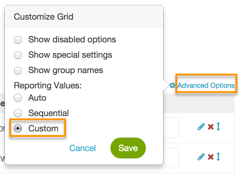
3) Let’s create the URL variables for the first multiple choice form—the one that’s included in the email. Click edit and open your question. To the right of the “Answer Options,” click Advanced options and choose Custom. 
The reporting values are what you will use to customize the URL in your email. I played around with this a bit. What I landed on was simply giving them the values of one, two, three, etc. — due to the fact that my team was changing what those questions were and the reports area of SurveyGizmo will show you the actual answers. (This is their help page.)
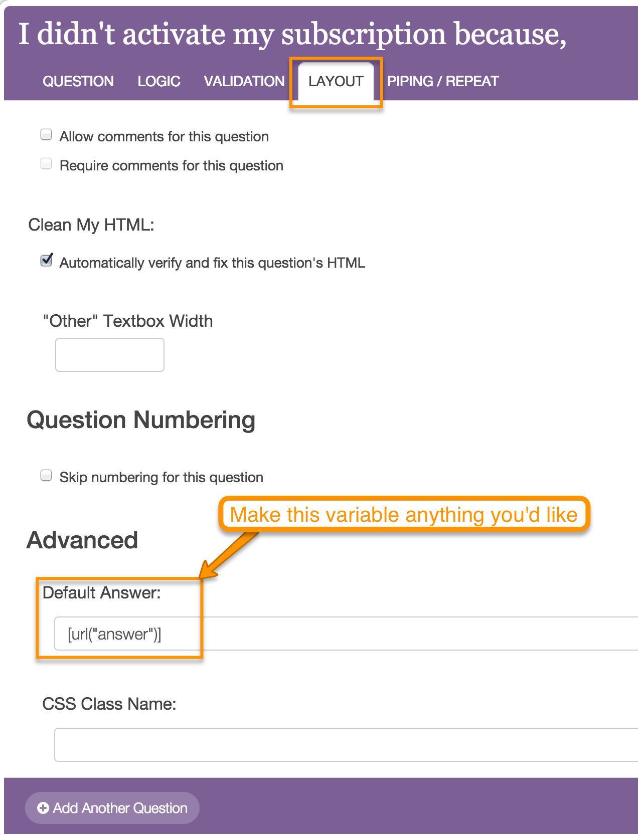
4) The second half of creating the URL variable is the merge value. While editing the question, click on the layout option. Scroll down to the Advanced area and add whatever you’d like to use for the URL variable. (I used the term answer.) This is the format: [url("yourtermhere")] 
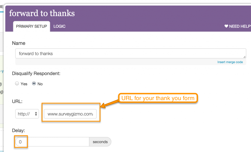
5) Move down to the bottom half of the page of your first form. This is where you’ll redirect the thank you page to the URL you saved for your second form. Create a new Action. Redirect it to the second form you’ve created with a 0 second redirect: 
(SurveyGizmo’s instructions are here.)
6) Now we’re ready to add the link to our HTML email in MailChimp. First, you’ll need to create an image that appears to be a radio button. I did it in a super highly advanced way — I went to a real form on my website and did a little screenshot. ![]()
I’m a huge accessibility advocate. Also, I know that some people open email with images turned off by default. For that reason, I chose not to include the words of the question into the image of the radio button. I want them to be real words. The radio button and the words/option next to it should both be linked to the same place. I put inline CSS onto the linked words to remove the underline from the link on the question — that way, it appears that the radio button and option next to it are associated, just like a regular form. Put a the radio button and linked words into a table in your email so that no matter what device your user is on, they’ll remain together.
7) Go to your first multiple choice form and copy the URL you’ve chosen to use. Then, add the merge value along with the reporting value. So for example, since I chose to use “answer” as my merge value and one, two, three, etc for my reporting values, my URL would look something like this:
http://www.surveygizmo.com/data/nameofform?answer=one http://www.surveygizmo.com/data/nameofform?answer=three
You get the picture. Essentially, you’re letting the image of the radio button and the words of the linked option automatically submit their answer to your first form — then quickly roll to your second form — the “fake” thank you page. If they choose to give you further information, you’ll get that in the second form report.
There are a couple other little tricks I’ll share in a follow up post. You can pass more data to SurveyGizmo from MailChimp (like first name, email, etc) and even customize your thank you page/form with that data. But this has gotten long…
Cheers! And please share your tricks in the comments.
