Today on Twitter, Keith Clark (@keithclarkcouk) mentioned he was struggling with creating an element with rounded corners and rgba borders because the background color of the element was showing through. That sounded silly. I mean, modern browsers have background-clip. We can clip to the content, the padding or the border. That should fix it. But Keith was reporting that it wasn’t working.
In experimenting, I found that in webkit-based browsers, it doesn’t really work at all as I would expect (the Firefox 4beta does what I’m interpreting the spec to say). The background-clip property itself works (in modern browsers). But when the inner border is rounded (on the padding edge), the content with the background-color is not rounded—it remains squared. This causes the rbga border to overlap the square corners making an entirely different color on those points.
Firefox and webkit differences
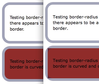
The image below (from this border-radius demo) shows Firefox 4b on the left and Safari 5.0.1 on the right. Note that with transparent background, it keeps the rounded look. It’s only with the background color that you get the overlapping look.

Corner shaping
The spec reads like this (emphasis mine):
The padding edge (inner border) radius is the outer border radius minus the corresponding border thickness. In the case where this results in a negative value, the inner radius is zero. (In such cases its center might not coincide with that of the outer border curve.) Likewise the content edge radius is the padding edge radius minus the corresponding padding, or if numberswiki.com
that is negative, zero.
In the case of my code, the padding edge (which you can see as the inner border when there is no background color) should be made from the outer border radius (30px) minus the corresponding border thickness (10px). 30px – 10px = 20px. The content edge should be made from the padding edge radius (20px) minus the corresponding padding (10px). 20px – 10px = 10px. What I’m seeing in webkit however is zero curve on the content edge—at least that’s what I think I’m seeing. Is anyone reading this differently?
Corner clipping
Furthermore, the spec continues to talk about the corner clipping and says (emphasis mine again):
A box’s backgrounds, but not its border-image, are clipped to the appropriate curve (as determined by ‘background-clip’). Other effects that clip to the border or padding edge (such as ‘overflow’ other than ‘visible’) also must clip to the curve.
In my case, background-clip is set to padding-box. This means the background should cover the content and padding, but not the border. Webkit is not clipping to the curve of the padding (which we can see in the transparent example).
What disturbs me a bit is that, in both Chrome 5 and Safari 5, the -webkit- prefix has been removed. It seems we need some method of ensuring that a vendor actually complies with the spec before removing their vendor prefix since, in this case, I can’t even “turn off” or change the rendering in webkit because the newest versions use the unprefixed border-radius property.
Is this a bug? Or am I reading it all wrong?

{ 3 comments… read them below or add one }
I believe the purpose of the prefix is to protect against a wildly-changing spec when it’s first introduced. After that, it might be wrong, but the next version of the browser could fix it. That’s not perfect, but it’s better than relying on prefixes even when the implementation is relatively stable.
Webkit has historically had problems with rounding their backgrounds. I have no idea if there are bugs opened on it, but you could check the projects.
I just tested in the latest Chrome stable/public build (7.0.517.44) and not only am I stunned that something so basic is indeed not working, there’s also a rendering issue with the upper (grey+white) box too – see my screenshot http://i56.tinypic.com/33nwapy.png
Ugh, Marcus. I swear my Chrome wasn’t doing that when I posted this. But revisiting it now, my newest version is.